5 Common Website Accessibility (ADA) Violations

In part 1 of this series we covered what web accessibility is, why it’s important, how to test for it, how to fix it, and the possible legal consequences of inaccessibility. In this installment, we will outline the five most common accessibility violations we at Smooth Fusion see.
Missing Landmark Roles
When you walk into an unfamiliar grocery store, one of the first things you do is read the signs hanging above each aisle. The signs display an aisle number and list relevant products by categories. You’re in and out quickly because of well-established, predictable layouts.
The World Wide Web Consortium (W3C) has a specification called ARIA (Accessible Rich Internet Applications). One of the features of ARIA that provides a consistent navigation experience to those using screen readers is the implementation of landmark roles. Assistive technologies like JAWS, NVDA, and VoiceOver assign specific keys or a combination of keys to specific landmarks so users can have consistent navigation experiences across sites.
Landmark roles improve website navigability and user experience by labeling sections of a web page. Rather than having to tab through each element on a page, users can skip over elements and navigate by section. For example, visually impaired users may navigate to the “main” role to skip directly to the main content of the page. Also, if a user is looking for the navigation, they can go directly to the “navigation” role to quickly access the menu.
Relevant Guidelines
Inconsistent Use of Headings
Heading elements are the h1, h2, h3, h4, h5, and h6 HTML tags used to identify content hierarchy. Headings should be nested based on rank. Visually impaired users depend on heading elements to be used consistently to understand the organization of site content. For example, h1 should be followed by h2, not skip rank to h3 or h4. Skipping ranks creates confusion.
Relevant Guidelines
2.4.6 Headings and Labels: Headings and labels describe topic or purpose. (Level AA).
Poor Contrast
Web-users with color blindness or low vision rely on the size and contrast of the font to be legible. WCAG specifies color ratios for normal text (4.5:1) and large text (3:1). Tools like WebAIM are a quick and easy way to test the contrast of your color scheme and fonts.
Relevant Guidelines
1.4.1 Use of Color: Color is not used as the only visual means of conveying information, indicating an action, prompting a response, or distinguishing a visual element. (Level A).
- Large Text: Large-scale text and images of large-scale text have a contrast ratio of at least 3:1.
- Incidental: Text or images of text that are part of an inactive user interface component, that are pure decoration, that are not visible to anyone, or that are part of a picture that contains significant other visual content, have no contrast requirement.
- Logotypes: Text that is part of a logo or brand name has no minimum contrast requirement.
- Customizable: The image of text can be visually customized to the user's requirements.
- Essential: A particular presentation of text is essential to the information being conveyed.
Missing Alternative Text Tags
Alternative text tags, most commonly referred to as alt tags, provide descriptions of images. Since screen readers can’t interpret images, visually impaired users rely on alt tags to describe the images on a page. Think of closed captioning used to describe nonverbal cues in films – be clear, relevant, descriptive, and concise. Some images may call for a longer description.
Here are two examples:
Bad: <img src=”flag.png” alt=”5554842”>
Good: <img src=”flag.png” alt=”Flag”>
Better: <img src=”flag.png” alt=”American Flag”>
Best: <img src=”flag.png” alt=”American flag waving in the wind”>
Bad: <img src=”dog.png” alt=”65445334”>
Good: <img src=”dog.png” alt=”Beach Dog”>
Better: <img src=”dog.png” alt=”Dog on the beach”>
Best: <img src=”dog.png” alt=”Dog wearing sunglasses and Hawaiian shirt on beach”>
While pictures like the two above come to mind when we use the term “image,” many websites use images for buttons. These should also have alt tags that define their function.
Note: Not only do alt tags help visually impaired users understand what is happening on the page, but alt tags help search engine crawlers index images more accurately.
Relevant Guidelines
Unlabeled Form Elements
If an assistive technology user is trying to fill out delivery or credit card information online and the fields aren’t labeled, they likely won’t be able to submit the form. If a required field is missed and the red asterisk isn’t labeled, the user won’t know why the submission failed.
Forms have numerous types of fields: text, checkboxes, radio buttons, and drop-downs. When fields are not labeled, users don’t know what they’re navigating to or what kind of response the form is requesting. This can be a frustrating experience for users who must complete a form to register for events, contact companies, or order products.
In some cases, form fields are labeled, but they’re labeled with generic terms like, “Checkbox.” While generic terms tell the user what kind of field they’re interacting with, it doesn’t tell the user what the field is requesting.
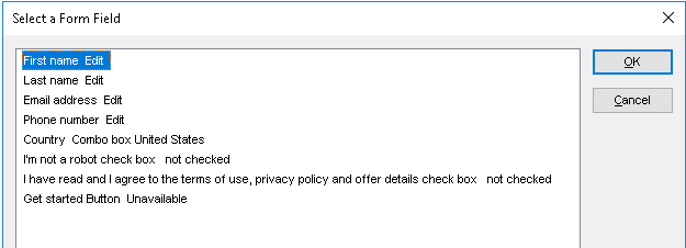
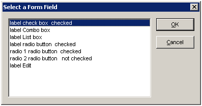
Here is an example of the JAWS screen reader view of well and poorly labeled forms:
Well labeled:
Poorly labeled:
Relevant Guidelines
1.1.1 Non-text Content: All non-text content that is presented to the user has a text alternative that serves the equivalent purpose. (Level A)
Smooth Fusion is a custom web and mobile development company and leading Progress Sitefinity CMS Partner. We create functional, usable, secure, and elegant software while striving to make the process painless for our customers. We offer a set of core services that we’ve adapted and refined for more than 250 clients over our 18 years in business. We’ve completed more than 1800 projects across dozens of industries. To talk to us about your project or review our portfolio, send us a message and one of our project managers will reach out to you quickly.


